SUMMARY

Blushup is a New York based beauty startup that aims to connect women to brands and kiosks at major department stores around the city. We were asked to build a Responsive website and to flesh out Blushup's unique booking tool in a way that was appealing to millennial users. To appeal to our audience, the site had to be easy to use, beautiful, dynamic and friendly. 

Company:  Blushup
Product:  Responsive Website
Role:  UX/UI Designer
Timebox:  2 weeks
Launch:  November, 2017

Disclaimer: All photos used in this design were pulled for feel and aesthetic, and will not be used in the final product. Blushup will acquire their own photos and imagery. I do not own the rights to any of the photos used. 

 
OUTLINE.png
 
Final Presentation -3.png

DISCOVER


Competitive Analysis

Comparative Analysis

User Interviews

Persona Development 


OVERVIEW

In order to better understand the current landscape of online booking services, we began our process with user interviews, competitive and comparitive analysis.

We interviewed women with diverse experiences in booking makeup services, varying tastes and preferences to understand their behaviors and needs.

We also took a close look at the booking processes and designs of companies like Opentable, Zocdoc, Glamsquad, Styleseat, and more.


COMPETITIVE/COMPARATIVE ANALYSIS

We looked at competitors and comparative companies to see both how they handled the booking service and how they established trust amongst their users. Additionally we discovered that there was indeed a need for this service as none of our direct competitors serviced this particular market. 


KEY TAKEAWAYS:


USER INTERVIEWS

We interviewed 10 women from diverse backgrounds to understand their needs, preferences, and behaviors when it comes to booking makeup services.


KEY TAKEAWAYS:

 
INTERVIEWS.png
 

PERSONAS

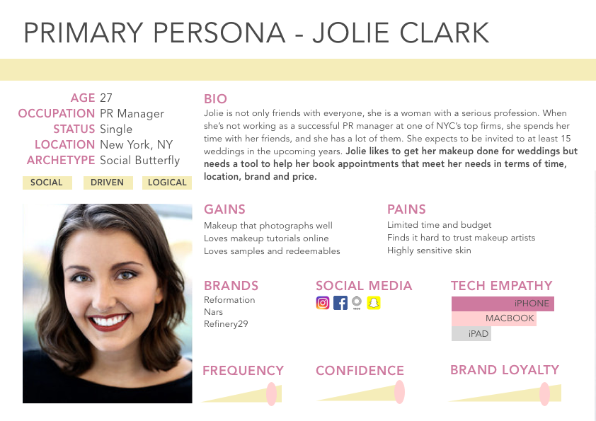
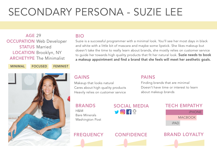
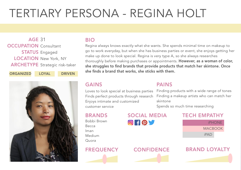
After completing our research and developing a strong understanding of our user and her needs, we created three personas that encompass Blushup’s user behaviors and needs.


PRIMARY | THE SOCIAL BUTTERLY: Search by location and time, redeemable services and rewards, pictures from other Blushup customers.

SECONDARY | THE MINIMALIST: Detailed information about service and brands, ability to contact retailers. 

TERTIARY | THE STRATEGIC RISK TAKER: Search by brands, view booking history.


PROBLEM STATEMENT


PROBLEM STATEMENT.png
 
IDEATE.png
 
FullSizeRender.png

IDEATE

Sketching

Low-fi Wireframes

Mid-fi Wireframes

Rapid Prototyping/User Testing

User Flows


OVERVIEW

Our team began the sketching process by participating in a Design Studio. We combined the best of the ideas into low fidelity sketches in order to test basic site functionality. 

Once we tested on paper, we made the appropriate changes and moved into mid-fidelity wireframes and tested on four users. Though rapid prototyping, we made several changes at the mid-fidelity level. 


SKETCHING AND USER TESTING - LOW FIDELITY

Our process began with ideation. The entire team participated in a Design Studio to rapidly sketch and ideate dozens of concepts for our design. We blended the best ideas into our first design iteration and tested for functionality and usability.

 
MOBILE FIRST -  iPhone was our users' preferred device. 

MOBILE FIRST -  iPhone was our users' preferred device. 


SKETCHING AND USER TESTING - MID FIDELITY

Midfi.png

After completing our mid-fidelity wireframes, we tested again.

After our decisions had been validated on paper, we moved our designs into Sketch and tested again.  

KEY TAKEAWAYS

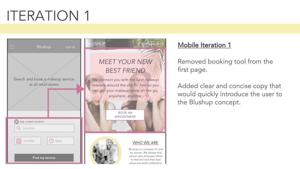
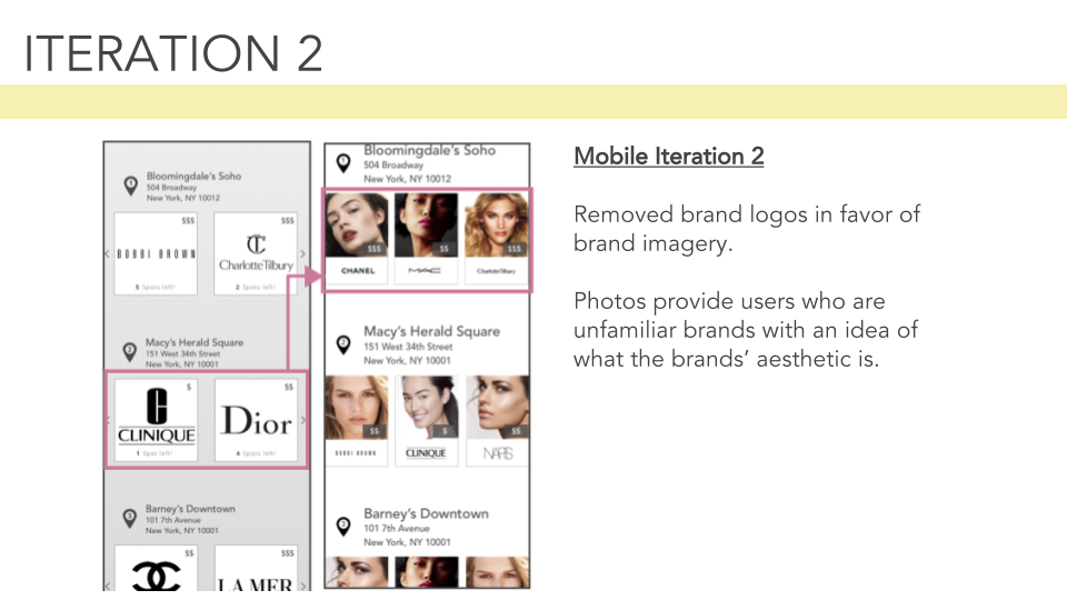
Our Millennial users expressed preferring photos over text.

Though our booking tool was functional and easy to use, having it on the first page was daunting for users especially when the brand was unfamiliar to them. 

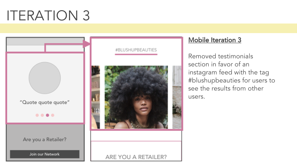
Testimonial section felt outdated, our users suggested that it be swapped out for a social feed to establish trust and brand confidence. We discovered that our users wanted a way to see photos from others who use Blushup.

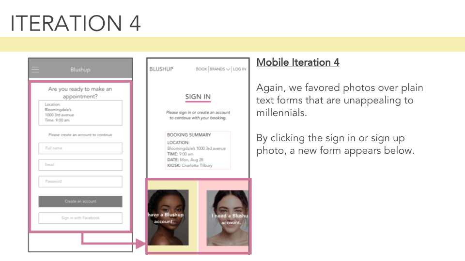
Sign up form was too text heavy and 'boring'.


USER FLOWS

Once we solidified the functionality of the site, we were able to solidify the site User Flows. These two flows depict the user's ideal path searching by location and searching by brand. 


iterate.png
 
Final Presentation -8.png

ITERATE


Field Research 

User Interviews

Heuristic Analysis

Hi-fi Wireframes


OVERView

After completing our mid-fidelity mobile wireframes and tests, we wanted to return to research to make sure that our designs in hi-fi and full visual truly met the needs and expectations of our users. 

We conducted field research and additional interviews at Sephora and other makeup retailers in order to fill in the gaps and to understand how to make our product both functional and delightful. 

Additionally we completed a heuristic analysis of the makeup service experience to understand how we could add delight for our users. 


FIELD RESEARCH


During the ideating process, we soon realized that we needed to get a broader perspective on the appointment process. We expanded our second interview pool to include makeup artists in order to better understand how they interact with clients and strive to manage their expectations. 


We spoke to makeup artists in Sephora and Bloomingdales who said:

Women are nervous that we won't be able to give them the look they are hoping for. 
We build trust with them through communication so they feel comfortable and confident. 
This experience should be fun, and feel like girl time. 


credo-beauty-store.jpg
 

USER INTERVIEWS

After getting the artist's perspective, we conducted more interviews with clients with the intention of gathering insights about their behaviors and expectations during the makeup service process. We strove to understand not only why they got they their makeup done, but what made the experience pleasurable and what actions or branding helped to established trust between them and the artist.  


KEY TAKEAWAYS: 

 
info.png

HOW CAN WE SERVE? 


From these insights, we moved forward with the intention of  designing Blushup in a way that felt fun, instilled confidence, and had that girl time feel. 


ITERATIONS

We user tested our hi-fi wireframes on four women, and made changes based on their critical feedback. Below are some select changes we made from hi-fi to color. 

 
Test.png
 
Main.png

TEST


Visual Mockup

Style Guide Development

Content Strategy

User Testing


overview

We built out our full color mockups from our hi-fi wireframes. We knew that testing in color would provide critical feedback from users regarding the feel of the product. 

Additionally we developed a style guide and brand persona in order to communicate brand trust and confidence to our users. In that, we included copy, content and cursors that gave the site a warm, friendly, approachable and delightful vibe. 


VISUAL MOCKUP

After testing on the high fidelity level, we created visual mockups that incorporated our user feedback.

Install MagicMirror.png
 

KEY SCREENS:


HOMEPAGE - Warm, friendly, image heavy. Primary focus on booking tool and establishing brand confidence through the 'Who We Are, What We Do, Why We Do It, How We Do It' section.

BOOKING AN APPOINTMENT - Faceted search that allows the user to find a service by current location, neighborhood, date and time.

BRAND PAGES - Serve to inform less makeup savvy users on what type of look or service to expect from their appointment.


SIGN IN/SIGN UP - Image heavy, interactive experience. User can't proceed forward in the booking process without an account.

MY ACCOUNT - Displays user's upcoming appointments, personal information, previous booking history, and rewards status. 

BECOME A RETAILER - Sign up form for department stores to work with Blushup. 


STYLE GUIDE

Final Presentation -14.png
 

BRAND PERSONA

We determined that the best way to establish brand confidence was to personify Blushup as fun, friendly and personable. 


Moodboards + Style Guide

We began playing around with image and color by developing a series of mood boards. After presenting the options to our client, the decision was made to go with the "Warm Girl" palette - a combination of warm pinks and yellows. 

We chose the Avenir typeface to give the site a cool millennial vibe and Permanent Marker for a handwritten touch on the brand images. During testing, we received feedback that the site accomplished what we intended it to. 


DELIGHTFUL ELEMENTS

Content Strategy

content.png

Original Cursors

cursors.png
 
o image.png

Want to collaborate?


Email me at mheaneyux@gmail.com